
So now that my summer project list looks like this:
– Finish deck makeover
– Buy wine
– Drink wine on made-over deck
I’m thinking that it’s time to turn my attention to our living room. I’ll give you a moment to take in the full effect of this space.


Sigh… Where to even begin?
We could start by discussing how 2/4 walls are spinach green.
We could talk about how the previous owner even painted the trim spinach green.
We could discuss how the spinach green walls are adjacent to two butter-yellow walls.
We could talk about the fact that the hallway is salmon. Yes, folks, we’re harkening back to 1981.
Don’t even get me started on how the foyer (the house is pretty open, so painting there will be necessary) is 2/3 butter-yellow and 1/3 cranberry red.
Now I know what you must be thinking. « Oh Sarah, you silly duck! It’s not that bad! » And you would be wrong. I live in a box of crayons, people. Except that Crayola created a box of crayons using only the ugliest shades they could find. This madness must end.
The caveat is that it can’t cost more than about $400 total. And you know what I say to caveats? BRING IT.
The palette I’m going for is light grey, navy, teal, and white. I’m really inspired by this painting, « Songs of Melusina 4 » by Lia Melia:

Sadly, Lia Melia’s art is WAY out of my price range (I’m coming for you in 5-10 years, though!). And yes, I do see the irony in the fact that there is green and yellow in that painting. Except not spinach-green or butter-yellow.
I’ll start by slipcovering the sofa and large armchair. Now, in a perfect world I would go with custom, but this world doesn’t have $900 to spend on slipcovers, so I’ll try this out:

The measurements seem ok and I like the colour, so I’m remaining hopeful. I’ll be checking it out at Bed, Bath & Beyond on Monday, so I’ll let you know how that turns out.
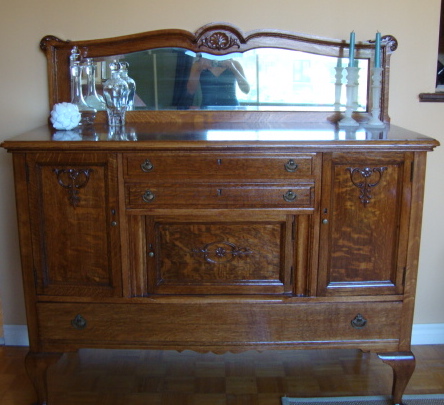
One thing to take into consideration is that our furniture contains a lot of medium to dark wood tones. For example, our piece-de-resistance is our antique buffet, which houses the good china. My dad spent weeks refinishing it last year and it is one of my favourite pieces, not only because both my grandmother (its original owner) and my dad have loved it, but it’s just so darn pretty!
The floors are also something we’ll be working on in the future, but those are most definitely a phase 2 project. (I think of phase 1 as the try-stuff-out-and-see-what-works step and phase 2 as the major-change-or-renovation-$$$ step.) Refinishing floors in not a project I want to tackle.
I think to keep things from looking too dark and old-fashioned, we need to keep the wall colour on the lighter side. Here are some of the choices we’re considering:

I’m stuck on whether to go more beige-greige on the walls with Ben Moore’s Edgecomb Gray:

Or maybe something of a truer grey like CIL’s Paddlewheel Grey:

Or maybe a lighter grey like CIL’s Marianna’s Aria (whose name I love, by the way):
 Hm.
Hm.
I’d love to do an accent wall (but ONE accent wall, not ONE IN EVERY ROOM… are you listening, previous owner?!), possibly on the wall with the arches. Or maybe even the wall behind the sofa. Or the wall with the window…
For the accent wall, I’m thinking of:
Ben Moore’s Georgian Bay

Or Ben’s Slate Teal

Evidence of Slate Teal’s awesomeness as an accent, courtesy of inspiredbycharm.com:

Ben’s Van Deusen Blue is also really lovely

Now, if I really want to go there with a colour, it’ll be Ben’s Hale Navy
 Oh yeah. Yum.
The lamp will be transformed by a white drum shade so that we play off the nautical-brass feel:

And I actually already own a lamp really similar to this:

So, with the slipcovers for the chair and sofa (approximately $110 with my gift card and 20% off coupon), the paint (budgeting $75), the drum shade (budgeting $20), and a 10% cushion, I’m left with about $175 to play around with for accessories, art, etc. Now, I’ve been hoarding saving gift cards for a while now, and I plan to use those bad boys!
Side tables are a definite issue, but since everything I like costs a million dollars, I think I’ll be scouring craigslist for those. I’m also highly unpractical, which means that I’ll probably by this before I buy side tables:

I mean, sure, you can’t put your wine glass on it, but it’s giant and gold and therefore WAY better than some stupid side table.
So there you have it, folks. The plan for the living room, which will no doubt change at least 10 times before I haul myself off my deck lounger to get going. 🙂 Until then, cheers!