Thanks for stopping by Flourish & Knot today! I am really pleased to be participating in the My Home Style Blog Hop, hosted by Casa Watkins. The hop, which began yesterday, features 20 bloggers’ homes! You’re invited to « hop » around by following the links from one blog to the next. It’s a fantastic way to find new, inspiring bloggers to follow. I know I have some serious house-envy for some of these ladies’ homes! If you’re arriving from the previous « destination », Blue I Style, welcome!
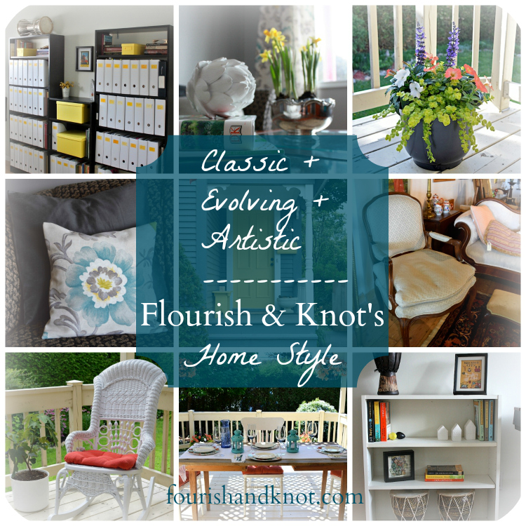
We settled on « Classic + Evolving + Artistic » to sum up the look and feel of our home. Let’s a take a little peek and see why.
Erick and I have both have very distinct and differing views on how our home should be decorated. It has taken us the better part of two years to come to a consensus on how we plan to make this house « ours ». Erick’s style is more traditional: he gravitates towards finely-wrought detail in furniture, and the fact that he is an artist means that he is quite picky about what goes on our walls. My style tends to be a bit more eclectic: I like a mixture of high and low-budget pieces, and I don’t mind if things aren’t match-matchy. We’ve melded our decorating visions together by agreeing on two things:
- That a hodgepodge approach is definitely a no-no. Things have to feel cohesive.
and 2. That just because we like a certain piece or style or colour doesn’t mean it will fit in our home.
As I said in last week’s living room update, our main living space is currently « in progress ». In fact, ALL of our house is « in progress »! Our furniture is a mixture of hand-me-downs and family heirlooms; so in that sense, it is in a constant state of evolution. As we invest in pieces that are more in line with our combined decorating style, our home is evolving.
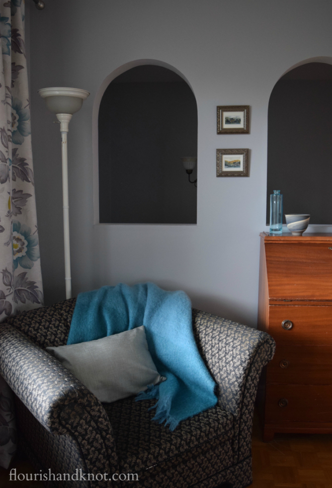
The evolution of our home is not only confined to our physical purchases. True, we love classic furniture choices that will satisfy our tastes for many years, but we also aim for a more updated palette: something that melds tradition and modernity. I love the mixture of our classic armchair with the lighter, grey-and-turquoise colour scheme:
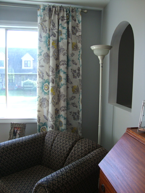
The grey and turquoise feel fresh, without fighting against our more traditional furniture. One of my favourite details in our living room are the curtains and throw pillows I made from this gorgeous grey, turquoise, cream, and chartreuse floral print. For all intents and purposes, that colour scheme shouldn’t work with our dark, formal couch and armchair. But the paisley in the upholstery is really a smaller version of the pattern in the curtains!
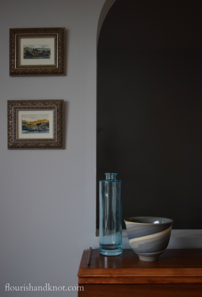
Since my husband and I are both musicians, and given his artistic abilities, we are always on the lookout for artsy touches to bring into our home. One of my favourite recent finds was this beautiful hand-thrown Neriage bowl by Hermann-Suzuki Pottery on Prince Edward Island.
Displayed above the bowl are two small watercolour paintings by my grandfather. An appreciation of art comes naturally in our family! (Although I inherited exactly ZERO artistic skill from him. Everything I draw looks like a duck with four legs. True story.)
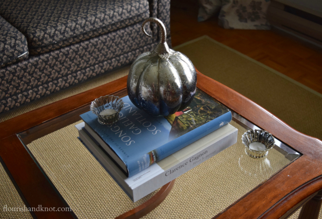
We also like to add little artistic touches to our seasonal decor, like this sweet handmade pumpkin from India:
It’s sitting on top of two of our cherished « art » books: « Songs of Gaelic Scotland » (an invaluable resource for traditional Scottish songs) and « The Art of Clarence Gagnon ». Gagnon was a Québecois painter, and one of my grandfather’s favourites. We firmly believe in « art » books that both look good and serve a purpose!
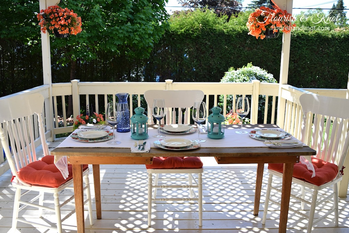
Our back deck is one place where we relax our style rules a little. I chose the colour palette and for once, Erick had nothing but good things to say! 🙂
We went with a preppy and chipper coral, white, turquoise, and dark blue scheme this year and it quickly became our favourite « room » in the house.
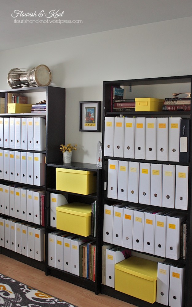
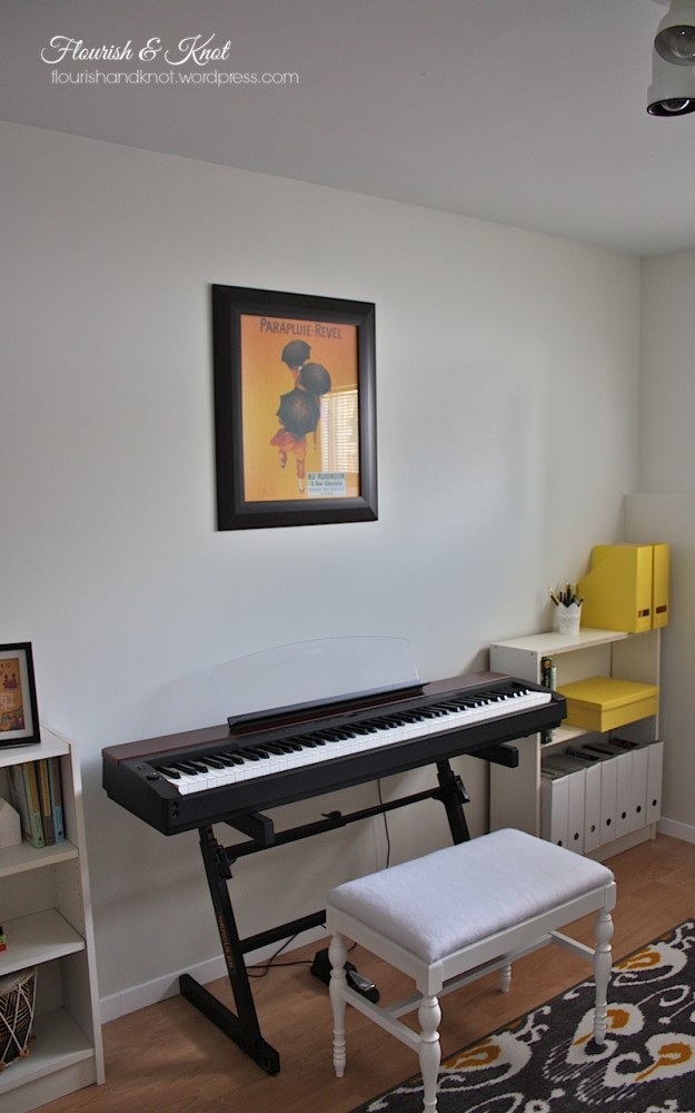
When we moved into our house, we agreed that we would consult and decorate all our common living spaces collaboratively (meaning I show Erick things on Pinterest and we disagree), but our two separate work spaces would be ours to decorate as we saw fit. When I made over my music room (on a low, low budget no less!), I went with a modern white, black, and yellow colour scheme.
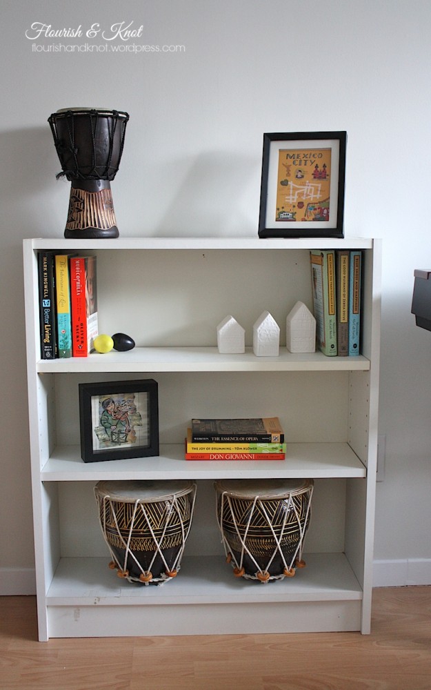
I am also a firm believer in shopping your home for decor items. We have a limited budget for decorative touches, so I tend to re-cycle older items or give them a new lease on life. The cute little Mexico City picture is actually a greeting card from Erick’s family! It was too sweet to part with, so I framed it and it adds a lovely little travel touch to my music room.
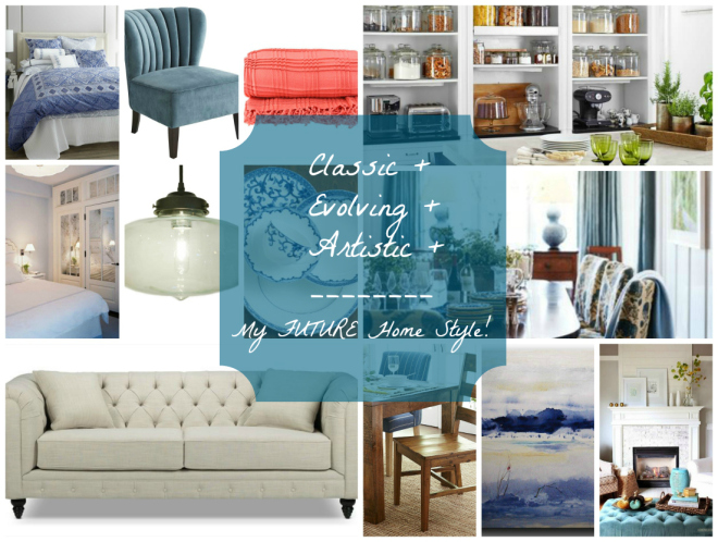
Before I sign off, I’ll leave you with a second collage. This one is of how I would like my home to look five, ten, fifteen years down the road. Of course I know that our tastes and needs will change, but in a perfect world…
Clockwise, from top left: « Marrakesh » bedding/« Emile » chair/« Astoria » throw/Kitchen (by Peter Callahan)/Dining Room (by House Beautiful)/Mantel (via South Shore Decorating Blog)/« Winter Sunday » by Studio Mosaic/« Tyler » dining chair/« Tristan » sofa/Bedroom (via Loft & Cottage)/« Filament » pendant light/« Mandarin Blue » china
Remember that as a blog hop, you are encouraged and welcome to continue on our Home Style tour by visiting our next « destination », Postcards from the Ridge! There is some gorgeous decor going on over there…
And in case you want to catch up on ALL the tour stops, here is the full list! I really encourage you to check them all out. We all have totally different styles, but everyone is so full of beautiful ideas for making a house a home. Thanks again to Casa Watkins for organizing all 20 of us and being our tour guide!
Now it’s your turn: which three word describe YOUR home’s style? Leave ’em in the comments!

