Welcome! If you’re new to Flourish & Knot: thanks for stopping by! I hope you’ll take some time to explore my posts and projects. I love sharing my adventures (and sometimes my misadventures) in the land of DIY!
It was a pretty exciting week here at Flourish & Knot. I woke up on Monday to discover that my Día de Muertos Luminaries were featured on The Huffington Post! Eeeeee!
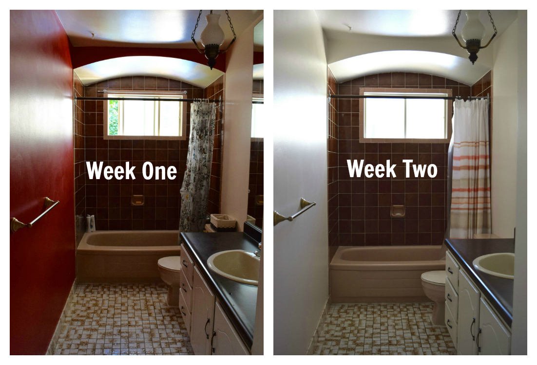
Last week I filled you in on my plans for Calling it Home‘s One Room Challenge. As a quick re-cap: I’m updating our master bathroom on a $300 budget in six weeks. I can’t change the tile, the flooring, the tub, the toilet, or the counter. I have a lot of work ahead of me.
Well, I’m pleased to inform you that our house is almost a cranberry-red-wall-free zone! (When we moved in there were three giant cranberry-red walls. There now remains one. And it is mocking me.)
The paint has gone on in the bathroom and it is looking so, so much better.
See ya, red wall!
We went with Benjamin Moore’s “Pink Damask” but in Rona’s house brand of kitchen and bath paint. And I’d like to go on the record as saying that THE HOUSE BRAND WAS AWESOME AND I’LL NEVER BUY DESIGNER PAINT! I cannot say enough good things about Rona’s house brand. It goes on like a dream. So no, I’ll pass on your $75-a-gallon-paint, thanks.
Where was I?
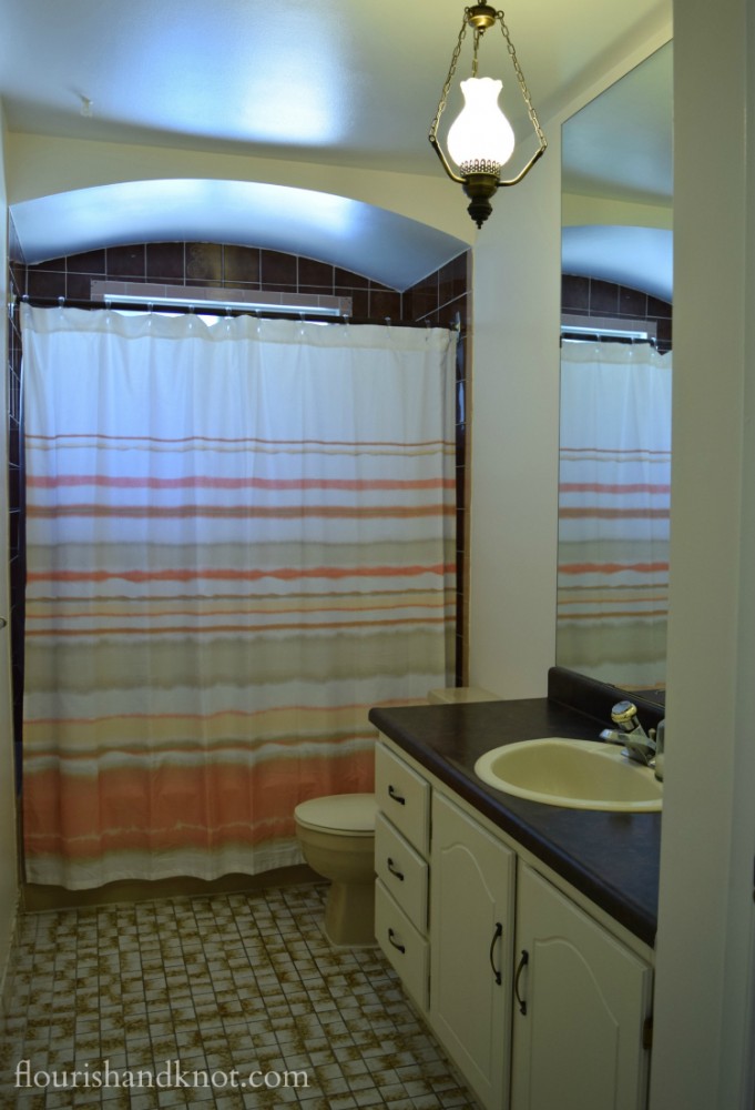
I took this photo so that you could see what it looks like with the light on. I’m planning to change out that particular fixture for something less Little-House-on-the-Prairie, but at least it gives you an idea. In reality, this room is rarely bright enough to… enjoy(?)… by natural light. Plus, I like to keep the shower curtain closed to hide all that brown tile.
As an aside, I’m quickly realizing just how tricky this room is to photograph. If you have any tips you can share with me, I’d love to hear ’em!
So what’s up next for this room? Well, framing out the mirror is the project I’ve sort of been dreading. Mostly because the amount I spend on it will determine how much I have left over for all the pretty shiny and cozy accessories!
Here are some of the options I’m considering. Let me know if you have a favourite, or if you have another suggestion. You can leave a comment at the end of this post!
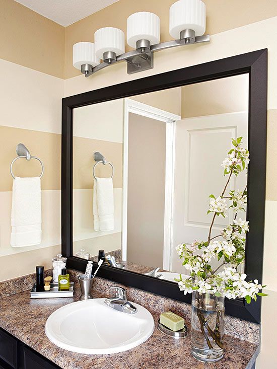
Option 1: Simple and contemporary
Option 2: Traditional and elegant
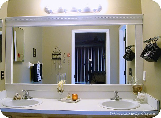
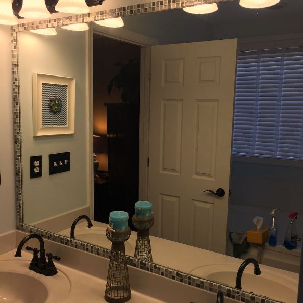
Option 3: Mosaic tile
I’d love to hear your thoughts and suggestions, so be sure to leave me a comment if you feel so inclined. Thanks for stopping by!
*****
Here’s where I link up each week:
Mondays: Merry Monday, Monday Funday, Inspire Me Monday, Show & Tell, Lou Lou Girls
Tuesdays: Tell ’em Tuesday, Two Uses Tuesday, Tutorials & Tips, Tuesdays with a Twist, Hit Me with Your Best Shot, Tickle My Tastebuds, Treasure Box Tuesday, Tasty Tuesdays
Wednesdays: Pin Worthy Wednesdays, Work it Wednesday, Wow Us Wednesday, Wake Up Wednesday, Wordless Wednesday, Whimsy Wednesday, Welcome Home Wednesdays
Thursdays: Think and Make Thursday, Handmade Hangout, Weekend Re-Treat, Favourite Things, Artsy Fartsy Link Party, What to Do Weekends, Friday Features (Thursday)
Friday: Fiesta Friday, Feathered Nest, Link Party Palooza, Friday Favourites
Saturday: Share it One More Time
Sunday: Nifty Thrifty Sunday, Silver Pennies, Sundays at Home, That DIY Party, Frugal Crafty Blog Hop, Share the Wealth Sunday, Food Stars
Monthly/Recurring: Great Blog Train, Sunday Brunch, Before and After



What a battle! For the mirror, I wouldn’t go for it unless I could find a combination of colours and textures that will not be “distracting” 5 years from now. The other 2 options are very classy and will be easier to match linen and accessories to.
Thanks for weighing in, Ariane! I agree about the tile… It really is my least-favourite option.
The first example, dark wood, is definitely the best choice. It goes with the current tiles and shower curtain and will go later with anything you choose.
Thanks, Susan. That’s my favourite, too.
I like the traditional and elegant frame…since you live in a charming house. I would not do the tile…It looks to busy, but that is just me. I love the paint color so far Nice! For your photography…you can always use place a mirror near your door so that it can bounce light off of the window OR you can buy a lighting kit OR a sun visor reflector thingy again to bounce light off of the window.
Thanks so much for the handy photography tips, Jessica! I’ll have to try the mirror trick.
That paint color changes so much! The bathroom feels huge now.
My first choice for the mirror is the first one. Especially with the chosen shower curtain I think it is a good contrast and goes well with the coral. I love framed mirrors and your bathroom is going to look awesome!
Thanks, Tiffany!
I like the first option, but I would go with a lighter wood colour – like the colour of the bathmat in your first post. The new wall colour & shower curtain also look great btw 🙂
Thanks, the lighter is the way we’re leaning now, I think.
Changing the paint and shower curtain has already made a world of difference in there! It looks bigger and brighter. My vote for the mirror is the first one with the dark frame. Great job!!!
Thanks so much. I’m leaning towards the white version, because my husband prefers it and I’ve decided on everything else, but we’ll see if I can change his mind… 🙂